
One of my favorite things is seeing the refinement process that happens in the Church Marketing Lab. Recently, Courtney Shehee posted options for a logo design she was working on for a girls’ retreat. The creative brief she included stated:
Goal: Logo needed for Student Girls Retreat
Audience: Student Girls
Direction: Title – “Adorned for His Glory” and Verse – Colossians 3:17
Project: Need logo for promotional items, screens during the event, and t-shirts
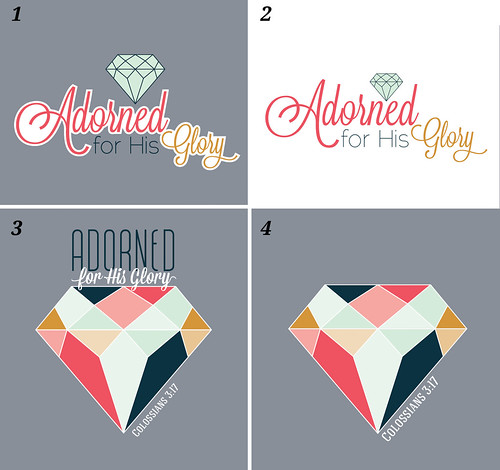
Above are the options she posted. She received some great feedback including:
- In #1, I would remove the white behind the text and change GLORY to a more contrasting color.
- I like #4. The colors and treatment really catch my eye. I definitely think for materials other than a shirt you will need a title. Maybe below or beside the diamond? Or “Adorned” above the diamond and the rest below? It looks crammed together now.
- These diamonds would look really slick without the outline, i.e. shapes floating on top of the grey background, the grey showing through where the outline would be. The outline on the text looks a little clunky, too.
- I think you just need to play with the colors a bit to get it to work on a gray shirt. And if you’re using it for other promo materials, you’ll want to make sure you have a logo that works across all areas, which I think #2 would do best.
That led her to make some revisions and a few days later she posted the following tweaks and comments:
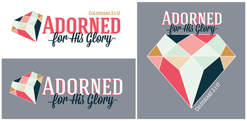
I wanted the logo to work across all promotions, so I decided I needed to play with the fonts a little more. The original script font was hard to read on the dark background. No matter how I changed the colors, I couldn’t find a solution that I was happy with.
I agree that #4 on the original logos was my favorite so I wanted to go from there. I plan on using the left layout for all promotions. The one on the right will be for the T-shirt. Cost will determine if I keep the words on the front with the diamond or put the words on the back with just the diamond graphic on the front. (I would prefer just the diamond on the front).
Thank you SO MUCH for all the help!
If you are stuck on a design or just want to leverage the collective wisdom of the group to improve, be sure to post your designs in the Lab. And, while you’re there, be sure to help others grow by leaving some feedback.


