It’s been a while since we’ve had a peer review, but never fear–they’re still here. This week we’re taking a look at an Easter poster, which is a good reminder that if you haven’t started thinking about Easter, you’d better.
Samples:
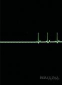
Poster:
Notes:
St. Paul’s Anglican Church
Toronto, Canada
Created by Sean Gallagher
St. Paul’s is a big downtown church that struggles with many of the typical urban issues, including rising real estate costs and parking. They’re located in a major commerce district, but also located a few blocks from the projects.
The posters went up in a subway station near the church and were also incorporated into flyers and bulletin covers. The plan behind the design was not to draw attention to the church, but to point people toward Jesus.
Questions:
- What do you like about the design?
- What do you think of the minimal approach?
- How well does this poster fit the church?
- What would you improve or do differently?


Greg
January 25, 2006
i absolutely LOVE it! simple, clean, thought-provoking, and true. amazing. job very well done!
Drew
January 25, 2006
I like the simplicity of it. I’m wondering what percentage of people see it and “get it”. I like the concept a lot. I would’ve included some text or tagline that explains or at least hints at what the image is all about. People like to “figure things out” in a design, but sometimes they need reassurance that they are interpretting correctly. This is especially true for the mere second(s) you have to communicate a message through a design.
patrick
January 25, 2006
that’s a fantastic poster. i wouldn’t change a thing.
Matt Heerema
January 25, 2006
# What do you like about the design?
I love it. I’m a minimalist at heart. This works very well. Very compelling and attention getting.
# What do you think of the minimal approach?
The only trouble I see with it here is that it conveys no information. You need to be familiar with the Easter story to “get it”. (And it may take those who are slower on the uptake a few beats to “get it” as well, even if they are familiar with the story.)
# How well does this poster fit the church?
I have no idea. I could judge by their Web site (and I want to) but I’m not sure that would be entirely fair.
# What would you improve or do differently?
Unsure. I feel that more info needs to be conveyed though.
rob
January 25, 2006
Oh I just love everything about it. Very great idea! I wish I had thought of it!
Jesse J. Anderson
January 25, 2006
ha!
Genius. Wouldn’t change a thing.
ACovington
January 25, 2006
Echo all of the above. Great minimalistic design. It did, however, take me a minute (or two, I admit it) to “get it.” A tagline somewhere in there might help those who are even slower than me. Otherwise, great idea!
Michael
January 25, 2006
I really like the concept and approach. Bravo!
Simple, tells the story…but yes, it does take a second. The fact that it is an Easter piece isn’t found until your eyes make it to the bottom of the page. I think that’s a good thing, you’ve surprised the viewers mind and that’s always a good thing.
Hopefully you are printing a large enough quantity to go to press (instead of color copier) for this.
You should be very proud of this.
I don’t think it matches your church’s website, but that says more about the site than this piece.
corey
January 25, 2006
My first thought is that I LOVE it. This is clever and hip design. I wouldn’t change a thing.
My second thought is: (*sarcasm warning*) I reeeaaally hope a CHRISTIAN marketing firm designed this or else it’s no good. :)
A.B. Dada
January 25, 2006
That is an amazing ad. We’re contemplating what to do for our Easter signage (we’re starting to change our outdoor signs every 2 weeks with something eye catching to prevent ad blindness). This one must be borrowed, does anyone have a contact number or e-mail address for the church?
A.B. Dada
January 25, 2006
I would not be the brightest bulb in the closet today, I just found the link to the church :)
Michael
January 25, 2006
That just hurts Corey.
Jana
January 25, 2006
# What do you like about the design?
Aesthetics: A+
Originality: A++
Communicates a clear and compelling message: D
# What do you think of the minimal approach?
I truly love it from the standpoint of beauty and concept. But I think it might be cleverness at the expense of effective communication.
# How well does this poster fit the church?
Have no idea, but it certainly doesn’t jive w/ the website.
# What would you improve or do differently?
– Think about your audience, and what’s keeping them away from church. Speak to that. If you’re trying to reach fairly intelligent people, familiar w/ the resurrection, who would like to go to church but are just looking for a convenient place, then this works. If you’re trying to reach the truly unchurched and/or those reluctant to enter a church, this does nothing to draw them there. (Unless, maybe, they’re a design aficionado.)
Brandon Meek
January 25, 2006
I love the simplicity of it. However, it took too long to “get it”. Trying to play dumb guy, is someone dying or is someone coming back to life (I guess it depends which way the machine runs). Thats probably asking too much from joe public.
A poster much communicate a message clearly and quickly to be effective and this does neither. So I say A for the simplicity, D for the poster, unless your target audience is Christians with a Medical background, then that beast is dead on! ;)
s. zeilenga
January 26, 2006
Duh.
I have been trying to figure out the poster for 3 days now and didn’t know if it was trying to hint at 3 crosses or something. I was all confused. Thankfully the above post righted my brain and now I get it. But, if it took me this long will it take someone else longer? Isn’t marketing supposed to speak quickly in this instant-pudding society?
or maybe I am just slower than usual…
Jim McGee
January 26, 2006
Took me a while to get it also — but I’m not sure that “getting it” will make much of a difference in whether someone is intrigued or shows up. Sometimes not getting it can be more engaging — an approach that certainly worked for Jesus.
I think the add would be even more effective if done in a landscape format with a longer flatline.
kevin
January 26, 2006
Jim, that’s a cool idea! I think a horizontal format would accentuate the point more.
I also think some sort of tagline would help people get it a little faster, though I don’t think some people not getting it is a problem. This isn’t a beer commercial with girls in bikinis. You either use something cliche (three crosses), or you use something that takes a second for people to get. I prefer ads that make me think a little bit.
Daniel
January 26, 2006
It took me a while to “get it”. Enough time that if I were walking down the street and saw it, I would probably pass by without paying attention.
I think the best thing to do would be to add one to three words, not to say like “Easter Time”, but more like “Death to Life”, “Death No More”, or “Death Ends Here”. The words should not describe anything outside of the poster though, just enough to get the person to say, “Oh yeah, this EKG isn’t flatlining, it’s doing the opposite.”
nathan
January 27, 2006
maybe its too frankstein…but a simple “He’s Alive” might work.
carl
January 27, 2006
# What do you like about the design?
I like that it shows the practicality of the resurrection.
# What do you think of the minimal approach?
Slightly too minimal for me but it is good
# How well does this poster fit the church?
The website is staid. They should have the same company design their site.
# What would you improve or do differently?
(I am pentecostal so you have to take that into account)
I would put the tag line:
“Experience the Resurrection” but only if the people would actually experience something on Easter other than a church service. If it is your standard sit, stand, kneel service then this is fine.
Shawn
January 28, 2006
Rad.
Gene Mason
January 29, 2006
Brilliant.
Dan
January 29, 2006
Maybe a simple “He is risen” just above the “Easter at St. Paul’s.”
hatji
January 29, 2006
Very cool poster. I missed this, I giess, but was this for Easter, 2005, or this coming Easter? If for 2005, is there any way to know how well it did it’s job?
sean
January 31, 2006
thanks for your feedback everybody.
i’m a writer, but tempting as it was to wrap it all up nice, i fought that for what it was.
a horizontal format would have been great, but it was a media buy for vertical space on a subway transit platform. that buy also helped me make my decision to leave the poster ‘unresolved’. a subway platform is a place people will stand waiting, or they’ll be looking through the train window again and again over the course of the month. a very quick resolution with a theological summation would have made it easy to dismiss.
i am still fascinated by the moment at the end of the shortest versions of Mark. ‘and they were afraid’.
‘he is risen’ and ‘alleluia’ and ‘the resurrection of the body’ were all notions that came much later, as a bunch of very shaken people tried to understand the nonsense the world was cast into when they saw the empty tomb and the stranger Jesus.
(NT Wright’s big heavy book on the Resurrection of The Son of God is interesting if you’ve got either the background or a lot of stubborn will)
anyhow, i wanted to say something essential about Easter in a very concrete way, without using the usual words or images. i don’t know if i quite managed it, but I wanted something iconic.
a couple asides.
i don’t know if this did much to drive butts to the pews. i was swamped and only really got the poster to the printer for the transit buy. if i’d worked more on collateral it would have been very helpful. ie., even some smaller guerrilla postings. there wasn’t a poster in front of the church as far as i recall.
i’m getting back to a notebook for easter this year. being a writer sort of sucks, because any headline almost invariably slips into the dismissable nonsense that fills the church blackboard weekly.
as i feel this poster wasn’t fully exploited when we used it, do people think it would be worth working it out in extensions, or do you prefer a new execution each year?
one follow up note. this idea wasn’t universally embraced by the congregation, from what i gather. the rector saw it and leapt at the idea.
but as i go back to the drawing board i can’t help but think i should really pursue what this could be as a multi-channelled message for easter.
Esau Kessler
February 2, 2006
The theme mortality vs. life is huge. My response would ahve been “Wow, there is s church that is clever and willing to take risks”, but then I am ‘the churched’. For the unchurched, which has now become a huge and growing crowd, and differnet approach on the same theme, in a language joe pagan can read. It is great, inspiring, refreshing, and well done. Entirely appropriate in a transit enviroment.
James Logan
February 6, 2006
I think the concept is fantastic and can be translated effectively into other mediums like television and even radio. It truly deserves significantly more exposure than what was indicated it received.
Lifesogood
February 15, 2006
Caught my attention. Got it right away. Please, don’t dummy it down with a caption. People are mostly intelligent. So what if it takes more than a minute to capture the concept?
How about showing a sheet on an empty slab in a morgue next? Sorry, this is a bit morbid. Besides, experience demonstrates most churches avoid “negative” advertising.
Kudos to the designer and the church willing to take a risk using the concept.