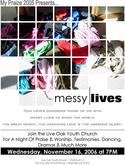
Take a look at this flier design for a youth group program called My Praize promoting their theme, “messy lives.” Please share your feedback and consider submitting your church’s work for a peer review.
Samples:
11×17 Flier:
Notes:
Live Oak Church
Hinesville, Ga.
Created by Jesse Atwood
Live Oak Church averages about 900 on Sunday morning and pulls in a multicultural crowd. The church has a contemporary feel with traditional aspects.
The youth group, called My Praize, meets on Wednesday nights and about three-fourths of the students also attend the Sunday morning program. The theme of “messy lives” will be pushed throughout each night of youth group and will focus on 1 Corinthians 1:27-28: “Isn’t it obvious that God deliberately chose men and women that the culture overlooks and exploits and abuses, chose these ‘nobodies’ to expose the hollow pretensions of the ‘somebodies’?” (The Message). They will be studying the lives of people in the Bible that had messed up lives, but God still used them.
The design will be used as an 11×17 flier, but will also be adapted to a business card size handout for teens to pass out and a powerpoint slide for announcements during church. It’s about to go to print in the next few days, so prompt feedback could help make some changes for the final product.
Questions:
- What do you like about the design?
- What do you think of the theme?
- What would you change?
- Do you think this will appeal to the target demographic of teens?


Amy
October 18, 2005
Love the look and message. But your date says Nov. 16, 2006. Is that correct, or did you mean 2005?
Michael
October 18, 2005
I think it looks quite nice. Took me a second to put the image together, but I got it pretty quickly.
The copy underneath needs some attention, text justified center isn’t easy for the eye to read and should be used more for titles. I think the spacing is a bit too much as well.
I think I’d consider dropping the Praize presents, which would allow for a bit more white space and breathing room.
The date text needs to be moved up just a bit to be justified.
Nice work, those grids can be a bear to get lined up, I like it!
Lindsay
October 18, 2005
What struck me is that the concept of “Messy Lives” could appeal to all teens (not just the ones coming to church and active in their faith) but how “churchy” the rest of the text is. “Great mercy,” “unending love,” “awesome glory,” and even “praise & worship” and “testimonies” are all heavily loaded phrases that may not appeal to many teens.
brand1m
October 18, 2005
Its very neat for something messy. I second Mike and Lindsay’s comments.
I don’t mind the grid holding everything together, but I want to see more mess. It takes a while to process what the image is. For a poster/flyer, I like stuff to be bolder. I think what does it is the white boxes near the washed out spots of the image.
Maybe you leave the messy|lives text alone, but I would re-think the fonts used at the bottom.
Justin Broome
October 18, 2005
Your wording is full of adult, Christian buzz words. If you want kids to read it, speak their language.
“God loves choosing people with messed up lives to change the world.”
The font looks like copperplate gothic, which is a cool font, but not what I would use for this. Why not try the bottom text with the same font as the “messy” and see how it looks?
I agree with ditch the “my praize 2005 presents…”
I’ll keep chewing on this…
Stu Mcgregor
October 18, 2005
i think the design is striking and draws my attention with a cool factor until i get into it. at the thumbnail size it was really really nice. then when i clicked on it, the text layout was just a bit nasty.
yep, don’t center the text unless you really have to.
i liked the greyed out text in the copperplate font. it’s everything below that line that reaally doesn’t work so well. it reminds me of an overprint on a band’s concert publicity poster.
the typeface is wrong. those ‘s’ in avantgarde are just too skinny compared to the fat ‘o’.
use arial or preferably helvetica and mix up the font weights for effect, rather than putting the black box behind it for emphasis.
but this is one of the better designs i’ve seen for a while, well done. it just needs some tweaking, not an overhaul like some of the others…
kevin
October 18, 2005
Jesse, I think you’ve got a pretty cool design here. It’s a great over-arching theme and I love the visual. That’s something familiar to teens, and not something they’d expect from a church. (Is that a pair of underwear in the lower left?! Awesome! Keep it real–don’t sanitize it.)
The all-caps font seems hard to read.
You mentioned to me in our e-mail exchange that your church web site is currently down, but assuming it’s going to be up when this runs, I think it’d be good to add a url.
I’d also agree with dropping ‘My Praize 2005 Presents’. I’m not a big fan of funky misspellings (though I realize that’s the name of your group), but I don’t think it adds a lot sitting up there. It will be meaningless to visitors and though it might connect with your current students, it seems more appropriate to work that into the copy.
Overall this is a cool design. I like it.
Steven Strunk
October 18, 2005
The design is good…I do agree with those who say drop the “My Praize 2005 Presents…”
I would change Messy Lives to Messy Living. The latter implies action and feels a little more rebellious. And if you’re trying to use this as a means to get unchurched kids to the event, a tag line something like this better speaks their language:
“Living for something bigger than yourself often gets a little messy. But wouldn’t you rather be God’s living, breathing mess than someone else’s dead and stagnant trophy? Do something with your life. Get messy with God.”
And you might want to consider changing the night’s events to “Music, A Good Hang, Dancing and More.” At the very least, drop the drama and testimonies. Nothing scares off unchurched kids (or church kids, for that matter) faster than the prospect of having to sit through cheesy, Christian drama. And the the thought of “testimonies” will likely scare the crap out of them (as in, they might even have to speak themselves!).
Don’t get me wrong, your dramas very well may be great…and likely are…and it’s absolutely essential that kids hear from their peers about what God’s done in their lives, but getting them there is the point and I don’t think advertising either is condusive to that end.
corey
October 18, 2005
I have to +1 what others are saying. Drop the “praize presents” and change the font and spacing in the all-caps descriptive area. I would find a way to use only the two fonts (or the same font in two different thicknesses) from “messy lives” instead of throwing the copperplate gothic in there. Especially in that descriptive area, it feels like it’s just been stretched out to move the eye from the graphic to the date and time. It should be it’s own strong element. I’m really being picky, though, as this is a good strong design. I like the juxtaposition of the rigid squares against the loose visuals of the wadded clothes AND the rigidity of a grid against the abstractness of having part of the grid randomly missing. Symbolically, it tastes good to me.
well done.
brand1m
October 18, 2005
I’ll say this on the activities that will be happening list. As a church kid, growing up, dancing at church typically meant put on your robe and grab a tamborine and a twirling baton, not the “getcha phreak on” kind of dancing that kids might think.
Anytime I see church and dancing, I get a little nervous. Hopefully, this is the kind of dancing that kids enjoy, not the kind that might freak them out.
s.e.whitby
October 18, 2005
i like the concept, but the overall design of the page betrays what you’re trying to say.
i imagine the message that you’re easy to understand in the midst of a messy life is a part of the poster, but unfortunately, the text is tough to read/understand.
– I’ll be the 43rd to suggest you drop the “presents…” line at the top. let the graphic be the first thing that is “read” by the eyes.
– the graphic is strong, so i wouldn’t compete with it so much with the text at the bottom. allow the text to be text, and don’t be cute with it. the centering and wide line spacing make it tough to read and too complicated. it looks almost like an unseccessful graphic.
– the list of activities might come off as pretty churchy, if you’re trying to speak to non-attenders. sorry to obsess over word-smithing, but the word “join” can be tough for a “non-joiner” to read without adding baggage. you’re not actually ask them to join yet, just to come try you out.
– use the white space to contrast the rigid nature of the messy photo. simplify the messy | lives logo to use the same typeface in different weights?
– start with most important text [date/time] and place it where it draws the eye best, and move backwards from there filling in your text in space where it fits.
good look overall if you can get the text to match the function. this will probably hit the teen eye well.
Dave Wakerley
October 18, 2005
Graphic design is great… just would tend to agree with other comments on the choice of working.
“Join the Live Oak Youth Church…”
Just seems to dance around invitation instead of grabbing the reader by the eyeballs and demanding their attention!
If you really believe in this night… then say so!!!
(Maybe use the word ‘dance’ instead of dancing… dancing implies that maybe I will have to dance! – while dance implies that someone else will be dancing)
:)
Dave.
Dave Wakerley
October 18, 2005
NOTE: should be – “choice of wording…” at the beginning.
Jesse Atwood
October 19, 2005
Muchas Gracias! Thank you, thank you… At first I thought, to be initiated into this forum would be pretty crippling. And in fact, that’s why i wanted to do it. I get tired of staff memebers or collegues saying “looks nice” and no constructive critisim to follow. But my first experience with Church Marketign Sucks has surpassed expectations.
Thank you for all the thought out helpful advice. I am a novice but in this iron sharpening iron enviornment I am sure to grow.
The comment about how clean the poster looks juxtaposed with the theme of messiness stopped me. I have to start layering my thinking. Thank you.
All the font talk? Geeks! I love it! I thought I was alone. You can look at a font and guess what it is… I have taken the font and weight comments and am currently reworking the lower half of the page.
The “churchy” speak… guilty! and i feel bad that i didn’t catch it. I concentrated on the theme and the graphic and didn’t think twice about all the “awesome love” “enduring mercy” speech. That has been revised.
And a note about the dancing: it’s not the robe stuff. It’s the hip hop, pop a lock, the bumping with no grinding type.. they come up with it themselves… But the imagery of flowing robes and church music playing did send a thrilling chill down my spine.
I feel honored that you all took the time to analyze my work. Every comment is greatly appreciated and if it wasn’t used to better this piece now, it has certainly bettered me as a… um, what am i? church marketing suckee, i guess. Thank you. God Bless.
Steve
October 19, 2005
I love the design — if this was intended for a gen x ministry. But for a youth ministry, I think it’s a little too slick. But then again, I’m not sure what kinds of kids you reach. I know for my youth group, it wouldn’t fly. The graphic design is sooo good, it looks like another ad, the kind you just disregard. Maybe that’s weird to say, but I think along with all the other stuff kids would see plastered on lockers, I’m not sure it stands out. If someone does take the time to look, I think they’ll totally dig it…. if they take that time.
If it’s a mailing flier, than go for it. If it’s meant to hang on the wall somewhere, I’m not so sure.
Dana O
October 19, 2005
As people already noted: there’s the date issue. Advertising for this event over a year in advance, way to go!! :)
Also, the concept doesn’t really fit with the title of the event. For being messy, those squares arranged in a grid sure are neat and orderly. If that it because it’s a design element — throw it out. Things in the design must always support the message, otherwise they’re just taking up space. I get that there is a photo of messy clothes, but that doesn’t explain why there is the need for squares to break up the imagine. it’s confusing….
Shawn Raloff
October 25, 2005
My question is – can I steal…I mean borrow…I mean glean wisdom from this great ad and use it in my own ad?
Zeek
November 7, 2005
I think this thing sucks. It kind of looks like a rave flier but contrary to it’s design I’m sure this group would be more like an anti-rave. I’ll bet ya there’s no real spiritual experiences or good vibes goin down here. Probably not even some good music. What happened to good old Calvinist churches where they were just blatant with their message? There are some of us that are going to heaven and there are some of us going to hell where fire and brimstone and Elvis Presley await thee type stuff. Like, I am better than you and I am the one who is always right 9 times out of 10, and all out blatant paranoia of all sin and of the suggestion that anyone else’s spiritual path could be valid type stuff, and singing old hymns that are at least sort of nostalgic…at least than the heathens would not have to decode the savvy relativistic jargon, and the happy glad hands greeting approach which changes absolutely nothing at all about the core message of at least 99% of all churches that carry the Christian moniker. Also, why does every church band sing songs that make Jesus sound like such a wuss. I mean, people always knock Jesus all day long, or they say well Jesus is the greatest, but really none of us knew Jesus, and the text that we have conveys only about maybe 30% of the guy’s years any way. I mean nobody screws with any historical figure as much as Jesus. But most people aren’t actually mad at Jesus, they just don’t like all the a-holes that think he’s still alive and that make him look like a jerk. And back to church music, most of the songs sound like some poorly composed David Gray or Counting Crows imiations and the lyrics sound like they have some underlying pseudo-romantic conversation going on, and when people are shaking their tail feathers and all squinting their eyes and stuff, anybody with the smallest psych background can’t help but to infer. I mean do you think God really digs on this crap? Please. Well, maybe your construct of God.
I don’t think for a second that most of these people have bad intentions at all really, but at the core of it, there is usually a very pious, concrete, indignant attitude which will always cry crocodile tears (of selfishness) whenever they are presented with valid information, and whenever someone explains to them that we can only at best prove that Jesus was a controversial and iconoclastic historical figure whose reputation was cemented by a forum held by Constantine the Great in early A.D., Constantine who by the way, also helped the Roman Empire deteriorate and who carried out atrociities in the name of his newly found faith. And early on in history we can read that the Christians began to forget about there martydom and turn the tables quite quickly. They seem to forget that Jesus Christ himself was alleged to be of the devil by most of the Hassidic spiritual leaders of the time, and if there were someone like him around today the modern church would no doubt want him dead too. Trust me I am not being sacrilegious here at all, if I was I would go along with all of the bull and pretend to be the epitimy of American Christendom so I could pick up a nice clean naive woman at the college groups like so many other people do. But please people, do you think your fliers are really blowin anybody’s mind? Thanks for reviewing this most sincere submission.
ryan
November 16, 2005
Ok! I like the flier with some minor adjustments: change the date, and lose the “My Praize” at the top. So what was up with the last post? Thanks for the history lesson, sounds like you are working out some anger issues. Out of the whole post only 1% was about the flier. Speak to the issue at hand.
Zeek
November 17, 2005
Well, I am glad you appreciated by rather abbreviated “history lesson”. If you would like to chat more, or if you would sincerely like me to more clearly explain my last post, by all means feel free to e-mail at. I will gladly explain it’s relevance to the issue at hand. Namaste.
lightninbugue@lycos.com
zeek
November 17, 2005
oh yeah plz excuse the typos ya’ll