In this week’s peer review we tackle the web site of NewSpring Church. Share your suggestions and thoughts in the comments.
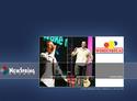
Sample:
Screenshot:
Notes:
NewSpring Church
Anderson, S.C.
Created by Jason Moorhead
NewSpring is a 5-year-old church that averages 4,000 on the weekends. They’re about to move into their first building in another month or so. They are affiliated with the Southern Baptist association and are conservative in teaching style but contemporary/edgy in music style. Their pastor is Perry Noble, who does a blog (among other things) that you may have heard about.
They have long term plans to add streaming video and an online store, and hope to begin work on the online store soon. They want the store to be top notch and include resources useful to the congregation, as well as appeal to non-Christians.
Questions:
- What do you think of the initial splash page with three choices? Does this work?
- How do you like the design?
- How do you like the content?
- How would you incorporate an online store into this site?
- What do you like best about the site?
- What would you change about the site?


Rusty Shackleford
December 2, 2005
The logo reminds me of Enron.
Ted Carnahan
December 2, 2005
For the visitor section, the worship video (quicktime) crashed my browser (Firefox 1.5).
As in >ALLFor the visitor section, the worship video (quicktime) crashed my browser (Firefox 1.5).
As in >ALL< of my tabs - gone. How frustrating.
Jon
December 2, 2005
The first thought that struck me about the front page in your screenshot:
white male – white male – white bread
(Going to the actual page, I see that it was random. Still, that was the “theme” that popped out at me!)
Dana O
December 2, 2005
The very first thing that caught me was how similar the logo is to Columbia Outerwear’s logo.
Although, I do like the 4 “e” significance — maybe just carried out in a different way.
Overall, the site looked a little cluttered. I think each page is trying to be too many things. Simplifying and focusing each area would help maintenance a clear direction, as well as keep viewer interest longer.
thanks for sharing!
Ryan
December 2, 2005
1. Initial splash page: I like the simplicity of the choices. I don’t like web pages over 800×600. While we may be able to count on most people have a screen resolution of at least 1024×768, we should not count on everyone using their full screen for browser windows. I don’t.
2. Functionally, I like the design. I particularly like the pull-down menus; they work fast and well, which is more than I can say for most. Visually, the design is a little cold. Churches seem to be putting a bit of a “corporate” barrier between themselves and their public.
3. The content is … a little much. My eyes just kind of glaze over a little bit looking at it. If the church really feels it is necessary to have all of this information available over the web, they should consider a drill-down approach, offering a small amount at top level and more detail as the user progresses through the site. There are 21 links in the top menu alone. This leaves the user unsure where to go.
4. The online store could replace the “Resources” tab. No one cares about “resources”; place the links to the resources where people would naturally expect them to be in relation to the various ministries or groups who would need them.
5. The best thing about the site is the splash page. Simple, easy choices—that’s what I like to see.
6. I would change the site so that your choices at the splash page matter more. Right now all that happens is that you are taken to a different page on the site if you click the “before you attend” link than if you click “members/attendees”. NewSpring should consider reorganizing the site to actually have different sections for each of these categories. Saddleback Church is a great (and well-known) example of this method.
Ben J Walker
December 2, 2005
I like the front page, looks clean nice, but wonder if it adds anything in terms of usability or just gets in the way of me getting to the info I want.
I’d go for some more lively and varied photos on that front page. Maybe some young people in one of them?
A brief look and I couldn’t find where the place was… apart from I know it’s in America! A second look and I see a little SC in the corner, but things like that don’t mean too much to us non-US guys!
Love the design of the site, nice clean and professional… although it maybe a tiny bit too corporate and maybe a little too image-based.
Good to see a Church web site better than most! Hope my feedback helps.
Brian
December 2, 2005
So we have an enron spoof and a wonderbread spoof on the same front page. Corporate America must be proud.
To me, it kind of looks like an off the shelf template. I would be more interested in hearing about working with Fellowship Technologies and this (I’m assuming) customized dotnetnuke installation. Thats one thing that concerns me about dotnetnuke. I have yet to see many sites that look good, using it. I suppose thats because many of the good designers aren’t designing for *.asp(x).
Can anyone clarify if this is based on dotnetnuke?
Perry
December 2, 2005
Kevin,
Hey dude–thank you so much for putting our website out there for some peer review.
I was checking out your site this AM & saw the “NewSpring” website and wasn’t thinking clearly & thought, “Hey–that looks a lot like our site!” DUH!
Anyway, we have put a lot of work into this site–it took about four months to complete; however, we realize that we are a work in progress and we have a long way to go.
Thank you to everyone who made a contribution to this post…keep the comments coming. The feedback is awesome!
And Brian…to your question…I have no idea…I can’t speak the language of you computer dudes. Maybe someone will address that in the next day or two!
God bless!
Steve
December 2, 2005
* What do you think of the intial splash page with three choices? Does this work?
I like it. FYI, “initial” is spelled wrong.
* How do you like the design?
I don’t care for scroll bars on the Newspring News part, but then again I don’t attend so I would be less likely to look at it anyway.
I don’t care for the logo at all. Maybe if the colors were changed a bit – something fresher and less board-gamey?
* How do you like the content?
Looks solid. Instead of having “Times and Directions”, I would place them right on the page so you don’t make viewers do another click. The less clicks, the better. The less scrolling, the better.
I don’t care for the “Pastor Perry Noble” stuff featured as each page description. As I visitor, it appears as if the church is the First Church of His Highness, Perry Noble. Please don’t take offense to this. I just think it’s a little unusual.
* How would you incorporate an online store into this site?
A store? What are you selling?
* What do you like best about the site?
Clean design. Easy to read and surf.
* What would you change about the site?
Logo and scrollbar on news.
Also, on the Perry Noble blog, the snippet “Vision, leadership, creativity” seems a bit egocentric. I would dump that and let his vision, leadership and creativity speak for itself. Again, please don’t think I am attacking the pastor – that is not my intent. For me, the over-hype crosses the line a bit. It seems to be in the realm on anti-humility.
Nathan Smith
December 3, 2005
Regarding whoever made this site: If the 1990’s come back, these guys are ready!
I would question the necessity of the Flash intro. I thought those stopped in the last decade. I mean, Flash is all well and good, but all it does it animate, and then sit there. Is that little effect worth alienating accessibility to those without the Flash plugin? Supposing a blind person wants to use your church website, they never get past the front door. Things to think about.
Once inside, the accessibility doesn’t get any better. Iframes, tables, and lack of good Meta keywords in the header make this incredibly unfriendly to search-engines. They’ve even gone out of their way to put “NOFOLLOW” for robots, which means search engines will never crawl the site.
And, what’s this? Spacer.gif makes an appearance, awesome. So, as we go down the list of bad web-design techniques, they seem to have hit them all. To quote a recent article on Accessify.com:
“Those people still delivering nested table layout, spacer gifs or ignoring accessibility can no longer call themselves web professionals.” – Source
To their credit, the site looks nice, but that’s just on the surface. Underneath there is a myriad of antiquated code. This site is not unlike the recent re-design fiasco of the Disney UK store (Explanation Here), that took a step backwards from its previous design. If I were the pastor, I would ask for a partial refund, and send the people who made the site over to Godbit.com and we’ll see if we can’t help teach them how to design websites for this day and age.
Feel free to let them know my opinion of them too. Perhaps they can find another profession, if they’re going to keep doing the same old, same old. :)
Nate Klaiber
December 5, 2005
I was going to make a post, until Nathan Smith said exactly the things I was going to say. Mainly, WHY flash for that first page? There is nothing there that cant be replaced in Image Ready if really necessary? It just gets in the way if you ask me. And the template, well, you can tell its a template – but a very poor template.
I dont mean to come down hard – but when we are talking about getting a quality website for a church – these things need to be addressed.
Sad part is, the templates out there for church sites (Truewell, vChurches, etc) arent any better!
All sites are a work in progress – and it can continue to evolve/change. I would just look into ways of making it evolve to fit standards and accessibility.
Peace,
Nate
Lance
December 5, 2005
The primary purpose of a local church’s web site is to be informative.
New Spring’s site has all the information a vistor or member could want -it’s informative, well designed, easy to navigate and does not look like the typical church site. Both a visitor or a member can get the information they desire with the ability to drill down as far or as little as they wish.
The only thing I found missing is a mailing address or office address.
Pat
December 5, 2005
I challenge critics to look up 50 church web sites in your city. New Spring’s site would be in the top 3 for best design, most informative, robust features and ease of navigation.
Love the “searchable data base” and “on-line giving” options.
If I had to recommend a change it would be that the site is very blue in color throughout. Maybe consider changing up the colors.
Very well done –
Nate Klaiber
December 5, 2005
Pat,
Top 3? Thats a pretty bold statement.
Myself and Nathan Smith were referring to the build of the site. If it was built in the 90s, it would be a fantastic site!
What about ratings for accessibility, load times, and standards?
I could make a site that looks good, has a lot of text/information, and a simple navigation – thats not hard to do. Even an amateur could create that in Microsoft FrontPage (*I shudder at that statement*).
We are talking beyond that….
Nate Klaiber
December 5, 2005
Also, I clicked to subscribe to the newsletter (didnt put in any information). It simply took me back to the main page? Why is that? Why are you starting them back at the beginning after signing up? Not only that – but the the splash flash page?
Just a thought – maybe you can check and direct it to the page they are on – only display a message letting them know the status.
corey
December 5, 2005
My first thought is that the site looks like a template site- which often tends to look watered down (so that many companies find them useful for their own purposes). But that, in and of itself, is not a horrible thing- it just contributes to the corporate feel that others have alluded to.
Probably more of a concern of theology than technology, I definitely agree with the over-emphasis on the pastor. By my understanding, the pastor is employed by the congregation and too much emphasis on the strength, talents, nobility, wisdom, engagement, etc. of any pastor puts things upside down and allows the well-lit pastor to shadow the cross.
I agree with what others have said- the site looks fantastic. And it has that state-of-the-art look to go along with their new state-of-the-art building they’ll inhabit as of 1/06. If they’re aiming to look like they have all their ducks in a row, I believe they accomplished the task. But the Jerry Maguire in me wonders where the person-to-person contact is? Where’s the warmth? (I agree the blue theme is a bit chilly for my taste, even though it’s my favorite color) I understand that the emphasis on the pastor might be the method by which they’re trying to make it look more human and less corporate, but we’ve already discussed that.
Frankly- where are the ugly people? Where are the sinners? Again, this may be more theological than technological (the two meet here at CMS, don’t they?), but the site is filled with what feels like beautiful, already-saved people. If one of the links on the splash page is for those who haven’t been there yet then the site is obviously HALF built for those not yet in attendence. If those people don’t fit the visuals in the rest of the site, then the message sent is one of exclusivity- which feels contradictory to my understanding of the gospel.
And here’s what sucks the most- as churches, we don’t have the luxury of leaning on a cool looking site. And we don’t have the luxury of choosing our own marketing message. It’s been assigned to us. So the site LOOKS great. A+ for initial presentation (especially compared to the bulk of church websites worldwide). But I think for the next redesign, a little less flash (both Macromedia and aesthetic) and a little more tactility.
Jared
December 5, 2005
Nathan/Nate,
Try looking at the site from the end users and target markets point of view instead of from a designer/technically adept persons point of view.
-Can the user find the information they need?
-Does the site appeal the target market?
Also, I was wondering, what are some church websites out there that you do like?
kevin
December 5, 2005
Amen, Jared! I think some of our web standards fans are getting a little harsh. They raise plenty of valid points, but I don’t think the particular definition of a doc type or whether or not you use tables is the most important issue.
Josh
December 5, 2005
Wow. Some of the comments… jeesh!
The staff at NewSpring that I’ve had the pleasure of sharing the internet with are some of the most humble people that I know.
I think the site does it’s job. It looks pretty decent. Sure, we’ve all noticed the logo… but that’s not what we’re talking about here.
I believe that the end-user would find everything that they’re looking for here.
Mark
December 5, 2005
The first page confused me. I looked at “before you attend”, “members attendees” and I saw pictures that I thought were representing transitions in a person’s life. This is what a person looked like before he attended and this is what a member looks like. After thinking about it for a few seconds, I figured out that it was a link menu, but it was not quickly intuitive.
Josh Fraser
December 5, 2005
Adding to Lance’s comment, I challenge you to compare NewSpring’s website with the quality of other megachurches in America:
http://hirr.hartsem.edu/org/faith_megachurches_database_cong.html
I’m not saying that NewSpring’s website couldn’t use a little improvement, but churches in general need to step it up the quality level of their websites!
Robert
December 5, 2005
First off, the site isn’t that bad looking, but is the site looking to look good or reach people?
If the purpose of the site is to reach people and draw them into the church, then let me ask a couple of questions:
1. What about those who don’t have the flash plugin because they have dial up?
2. What about those who have disabilities, say the blind, have they been considered? If not, do you not want people who are blind to know about your church?
There is more to web design and development than the look of the site. You may think it looks great, but is it accessible to all people? If the site is not, then the Church is sending a message to those who cannot access the site: ‘we don’t want you.’
That is the message that many of us are concerned with that many Churches are sending out.
So, my last question is simple: Do you care about the look or the people?
Yannick
December 5, 2005
It’s not about whether or not they have all the information a user needs. The information is there, yes, but what good is it if the user can’t access that information. If the user doesn’t have flash, then they cannot view the rest of the site past the frontpage unless they know a direct link beyond there. If the user does not have javascript turned on then they cannot navigate the site. Now how can you honestly say that the website does what it is supposed to if a user cannot access all that information? Ask yourself that question.
I have no doubt in my mind that the designers are humble. But the whole point of this is to give a review of the site and the points that Nathan, Nate, Robert and Mark have made are perfectly valid points and worth taking into considering. Their comments are there to help the designers can make it even better.
I think the site looks good, no doubt, but a website should never be all about the looks. What goes on behind the scenes is important as well.
Peace and God Bless.
Nathan Smith
December 5, 2005
Funny, I hadn’t even mentioned the Doctype. HTML vs. XHTML isn’t really my point – It’s accessibility.
I did look at it from a end-user’s point of view, saying that the Flash intro is just eye-candy. And, I look at it from a developer’s point of view because I care that the church not be 10 steps behind the world…
>> Can the user find the information they need?
— Yes, with 20/20 vision, and the Flash player installed.
>> Does the site appeal the target market?
— Highly subjective, but I’d say yes, it’s “good enough” which unfortunately is where the Church as a whole tends to rest.
>> Top 3 church websites.
— Do they even break the top 100 of all categories? It’s like the way we track Christian music sales – “Oh, we don’t have to measure up to the rest of the music industry, we’re Christian.”
Currently, you who are defending the old paradigm are in the beginning stages of what has been dubbed:
— The Six Stages of Technological Acceptance.
I’m just trying to help you realize where the web is heading, like it or not. Laws are being written in Australia that can prosecute public organizations for having inaccessible content, and other countries are starting to follow.
Kevin: I’m sorry for causing a stink on your site, after you so graciously did the interview for mine, but I’m just trying to “Frustrate, Educate, and Motivate” people to expect more from church websites. If I need to be the bad guy that nobody likes that’s fine, so long as it affects positive change in the long-run.
As far as Christian websites I like…
— http://godbit.com/featured/
^ If we’re ranking church / ministry sites, those are the top-notch ones, and what I’d like to see other churches shooting for.
Boyink
December 6, 2005
I keep telling myself that I’m not going to do this anymore…comment on sites that I had nothing to do with building…yet here I am..;)
I just have this quiet, gnawing discomfort with the notion of these peer reviews.
Here’s why:
I always describe a website as an iceberg. The part of the site we can see in our browsers sits atop a whole raft of decisions, goals, dreams, and thoughts that we aren’t privvy to. Not being privvy to them, we can only comment on the visual manifestation of the site – how it’s implemented. Does it validate. Is it accessible. Do we “like” it.
These aren’t the most important questions. And we’re not the people who should be answering them.
The more important questions are: Why was the site built? Did the leadership of the church initiate the project, or was the site pushed on to them by a tecchie who attends? Was there a formal strategy for the site, and is it meeting that strategy?
Who is the site trying to talk to, and are they listening? Was this audience involved in the site build? Has it been tested with them? Is the site part of the daily “breathing” of the church, or just something “tacked on”? Is it meaningful to anyone? Has it deepened the faith of anyone? Has it actually contributed to someone crossing the line? Has someone met God on this site?
I feel like I keep sounding the same drum…but the notion of a site’s value is an important one to me. Being web-heads we *get* the value of the web, and cry out when we see opportunity lost through poor implementation, inaccessibility, etc. But I wonder if the reason church sites suffer from those things is that the leadership doesn’t see that same value, so doesn’t want to invest the time/money/effort etc.
In other words, don’t try to sell a senior pastor on web standards. It’s the wrong message for the audience. Sell a senior pastor on how the site can build community, further the teaching, further the reach of the church, and reach people it’s not currently reaching. Get something out there that can show that value that we inherently see..and leverage the excitement of success into a more standards based accessible site.
Nathan Smith
December 6, 2005
My sincere apologies. Sometimes I put the cart before the horse, so to speak, and am over-zealous about the methodologies.
Jake
December 8, 2005
With a couple references to blind people, I’m curious to know how many blind people surf the net to find information about churches or other pieces of information for that matter.
Nate k
December 8, 2005
RE: Jake
Regardless, as is the nature of the web, we dont truly know if blind people are using the site. Its accessibility. You are eliminating a POTENTIAL audience. I dont feel we can assume a certain target market and eliminate others. Thats like a large restaurant saying ‘well, how many people do we really have who are in wheelchairs, we dont need to make our bathrooms accessible.’ Or ‘How many blind people really come in here, we dont need to have a brail version of our menu.’ The minute one of those DOES show up, they are not prepared and have lost a potential patron, money, and relationship. Why bottleneck?
RE: Boyink
I agree with you in the communication process, and even the critique process. I still think we have a priority as web professionals to educate those around us, no matter what words we use. It is important for them to understand the vision and capabilities. Its a whole package deal that needs to be understood. Want to build your entire site in flash cause its cool? Well – here is what will happen if you do that. Want to embed everything into an image? Well – here is what will happen if you do that. Etc. The list goes on. I believe we still bring valid points to the table, and dont think that we should separate as ‘Christians’ for our scale of development. So, to sum it up – I agree with what you were saying, but I also think you can take it a little further with the education process. Dont let it be the blind leading the blind. We are professionals and dont need to hide what we know (not just opinion, but the facts from validation, W3C, etc).
All sites can be molded over time – I think sometimes we review like its a static ad thats already out to print and cant be changed. We need to realize that things can change over time if people are willing to work at it.
EXAMPLE: My current site. I havent touched it in over a year. So, while I preach ‘tableless’ design, I still have an older website using tables. While I preach ‘css nav tabs’, I still have image rollover tabs on my site. One of these days I will get around to changing it – but its a process, ever-evolving (and I am not doing as much freelance since I got a full time job).
Nathan Smith
December 8, 2005
Jake: Your response exemplifies what I’m advocating that we try to change: Indifference towards the disabled. Of course the statistics on blind usage of the web would be low.
Now, ask yourself, is that because they don’t want to? If so, we shouldn’t bother developing sites that cater to them. Rather, and highly more likely, they do not use the web as much, because people ignorantly leave them out in the cold when developing sites.
All I’m saying is: The days of compromise on accessibility in favor of presentation for non-disabled people have come to a close. It’s now possible to do both, and we as a the Body of Christ should be leading the way, showing consideration for more than just the average person.
We take up special collections to help those who are mobility impaired, because the law requires ramps for those in wheel-chairs. Yet, we do mediocre websites and completely disregard other types of disabilities. Why? Because we as human beings are lazy, and won’t change unless we have to. There will come a day when accessibility will universally be required by law. It’s already happening in Australia.
Jesus didn’t discriminate against against the blind, he healed them, as he also healed those who could not walk. My question is, will we as Christians be riding the crest of the wave, ensuring accessibility, or will we be dragged along in the under-current of progress? Throughout the past century, Christian usage of technology has been a step behind the rest of the world.
I say that we have a unique opportunity to make the gospel accessible to everyone, an opportunity with implications comparable to the advent of the printing press. We have the ability to present the good news in today’s vernacular to everyone. Will the Church today realize that, or continue to defend the status quo? We need to decide.
One thing is for sure. You can no longer feign ignorance to the problem. There is simply a choice to be made. Do you care about blind people, and implicity value them as equal to yourself in God’s eyes: Yes or No? Let your actions reflect that answer.
Nathan Smith
December 8, 2005
I couldn’t resist, this presentation is just too funny…
— Why Tables for Layout is Stupid
Robert
December 8, 2005
If a Church has only 1-2 people who are in wheelchairs, should they skip making access for those in wheelchairs?
If they Church only has 1 person who cannot hear, should they just say who cares and not have someone tell the deaf about Jesus Christ?
If the Church only has 1 who cannot see, should they say who cares and not provide a braille Bible for them so they too can hear the Word of God?
The Church should never say, who cares, even if it is only 1 person. It is the Church who should say we do care and will do whatever we can to make sure everyone hears the message of God.
The stats would be low for blind people on the web because they are forgotton on the web. Should the Church take the same stance and forget them too? Is that what Jesus would do, forget them, because they are only a few?
Tell me, if you went blind tomorrow, wouldn’t you want to try and live the same life you lived before? Do the samethings you did before? How would you feel, if you went to Church and they said, sorry you are out of luck, we don’t cater to you because you are only 1?
You have to ask yourself, would Jesus say to the blind, sorry, you are only a few, I won’t show you who I am? No, Jesus cared for everyone, especially those who were without. Why can’t the Church to the same as Jesus on the web? And why do people who are Christians have a problem with those who want to do as Christ did, on the web?
Nathan Smith
December 8, 2005
The discussion continues here…
— Do We Really Care?
Jake
December 8, 2005
Nathan, you misunderstood the intetion of my post, and even went as far as to paint me as a “flippant” individual on your blog. But, I still think you’re a pretty awesome guy, even though I hardly know you.
Nathan Smith
December 9, 2005
Jake, sorry about that. The article will be edited accordingly.
Dan
December 9, 2005
On accessability
I think the blind/dialup thing makes sense.
If you missread or totaly miss the paragraph under the welcome immage, you dont see that its in the Fine Arts Center. I would repeat that on the map. Realy a picture of the building and a few pics to showcase the parking volunteers could add to that page.
The children go to a children’s are while the adults are in “Big Church.” It works out great, but without giving a bunch of rules the idea should be addressed on the website. That can go under the “what to expect” heading.
Rita Thompson
February 20, 2006
You think you are sooo good. If you are sooo good then Perry, you need to quit bashing other churches and thinking your way is the only way. You are such a poor speaker and I dont see why people like you so much. All you are about it yourself, and why not have a cross in church. That seems sacreligious if you ask me. Your thoughts on the cross suck. Christ died for my sins and the Cross, hello, is a symbol for that. So you need to watch what you say because you dont know it all!!!!! Try to get off your high horse and act like a preacher.
Ro Rogers
May 11, 2006
What is the purpose of this website? Why is there the need to critique a website while we are at it? The purpose of a website is to inform individuals about things. The end of a church website is for people to connect with Jesus, not for the website to be spectacular and for the people who created it to worry about bullet points…
Jason Thrift
October 20, 2006
Just throwing this out, but has anyone ever realized that the four “Es” in the formation they are in look ironically like a Swashstika? Wondering if anyone else noticed…
CMS guy
February 29, 2008
Does look a bit like DNN, but the design or the look of those sites really has nothing to do with the Content management system. Skinning for dotnetnuke is just like doing it for any other CMS – power is solely in the creativity of the designer.
Are less creative people designing for DNN & Microsoft? Perhaps – at least this time in the culture open source seems to jive more with the society of programmers and designers.
But if you are a church looking to launch in DNN, you can have a great-looking site. Just come up w/ your psd and take it to someone who regularly skins in DNN. It will turn out just fine
Logo Sample
August 13, 2009
A portion, piece, or segment that is representative of a whole
Logo Sample is a Set of logos or gallery of logos
Good Newspring Church Sample